T-mobile
Led the redesign for T-Mobile’s identity following their merge with Sprint. We pushed T-Mobile to simplify their logo by removing three of the digits, which would enable them to further elevate their symbol to a standalone icon status.
Logo
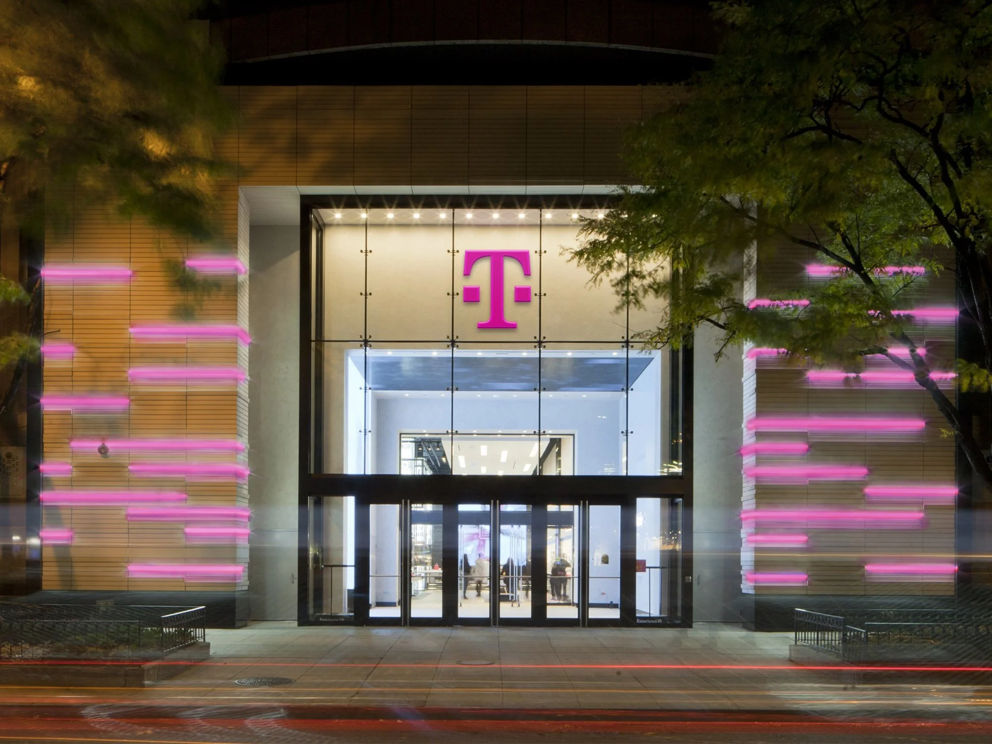
Retail
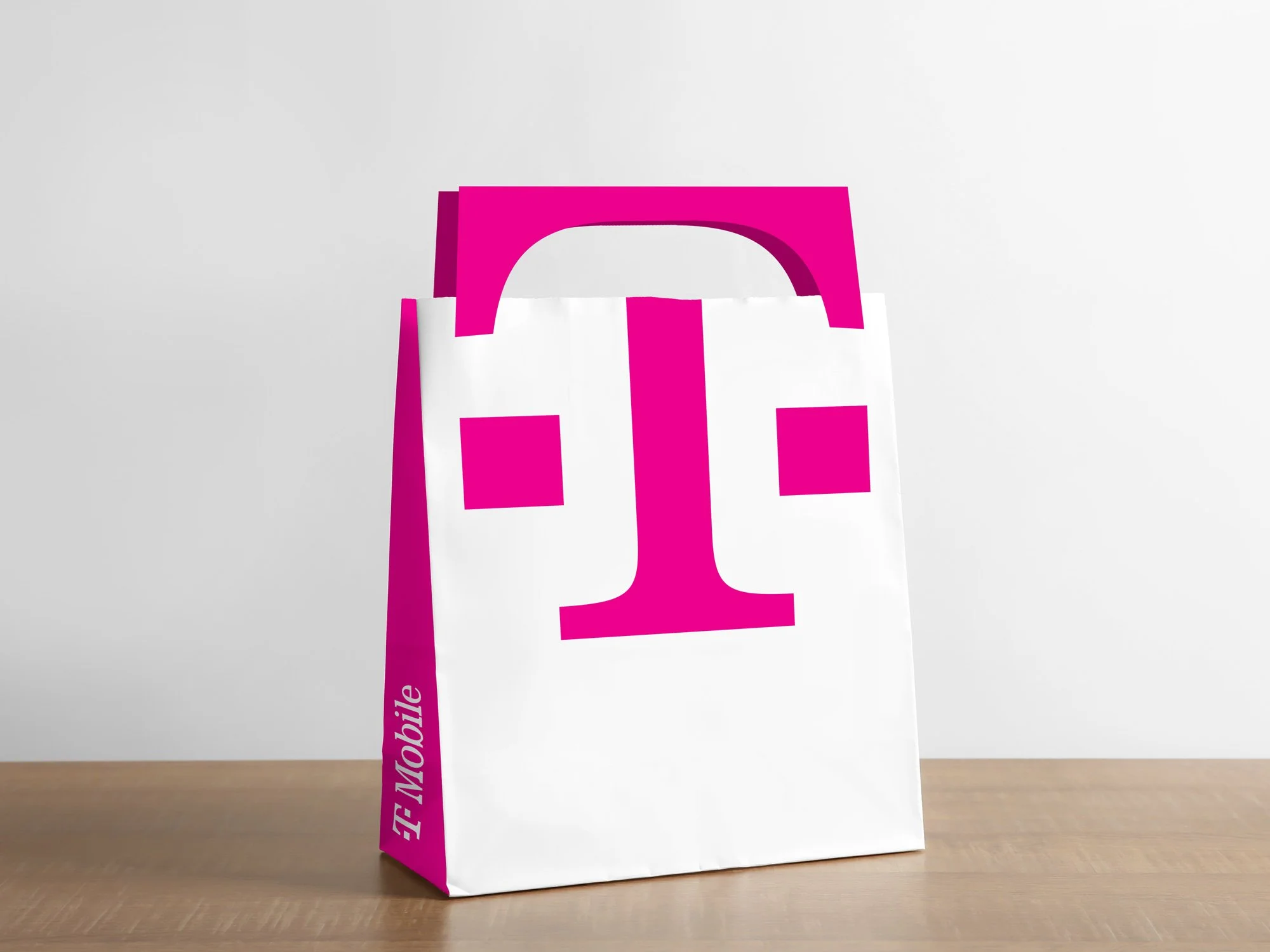
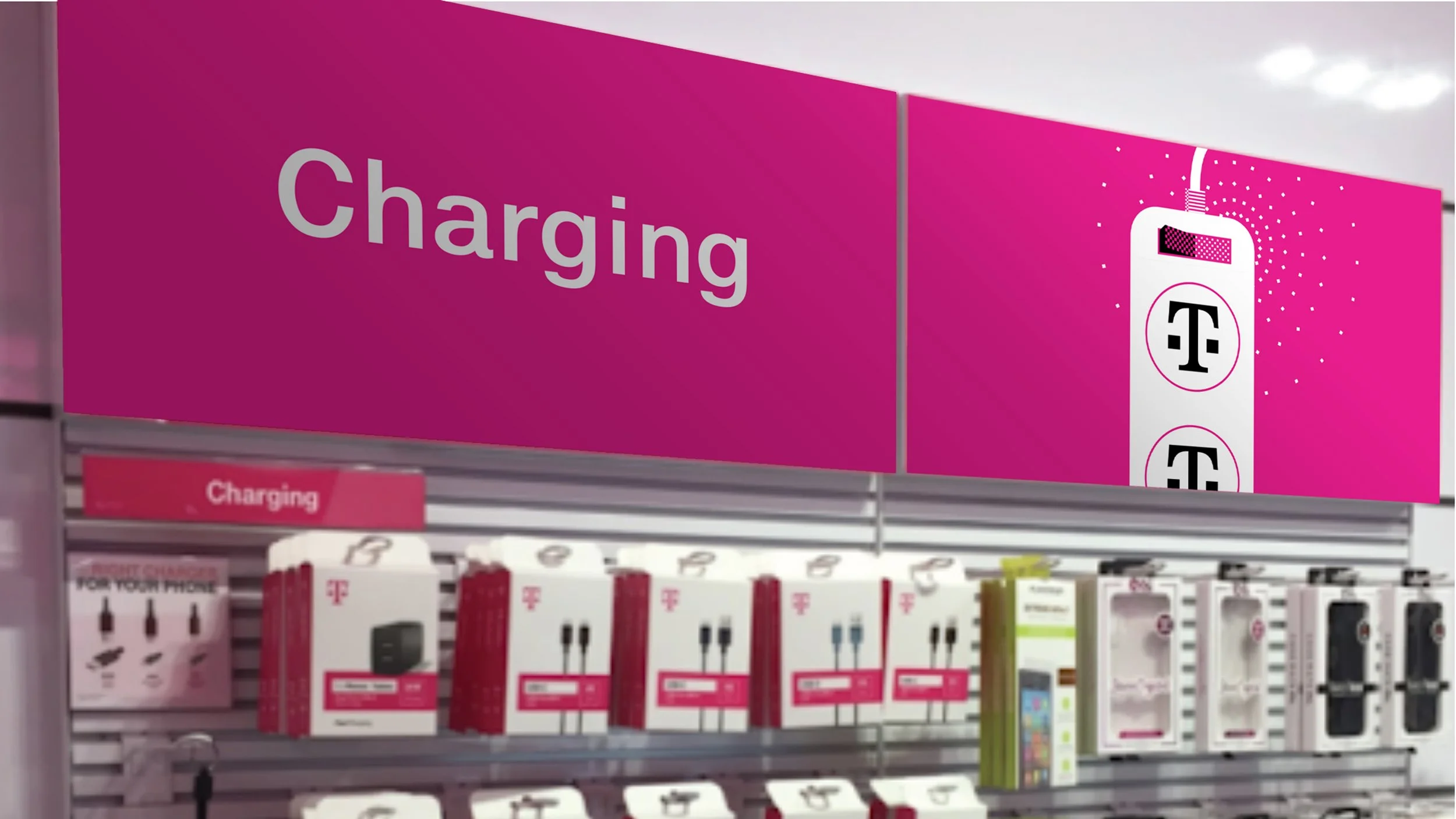
Elevating the t icon
Because the T symbol and T-Mobile’s magenta hold such a strong association with the brand, we were able to utilize the T icon, in almost infinite ways, as a graphic element, for storytelling.
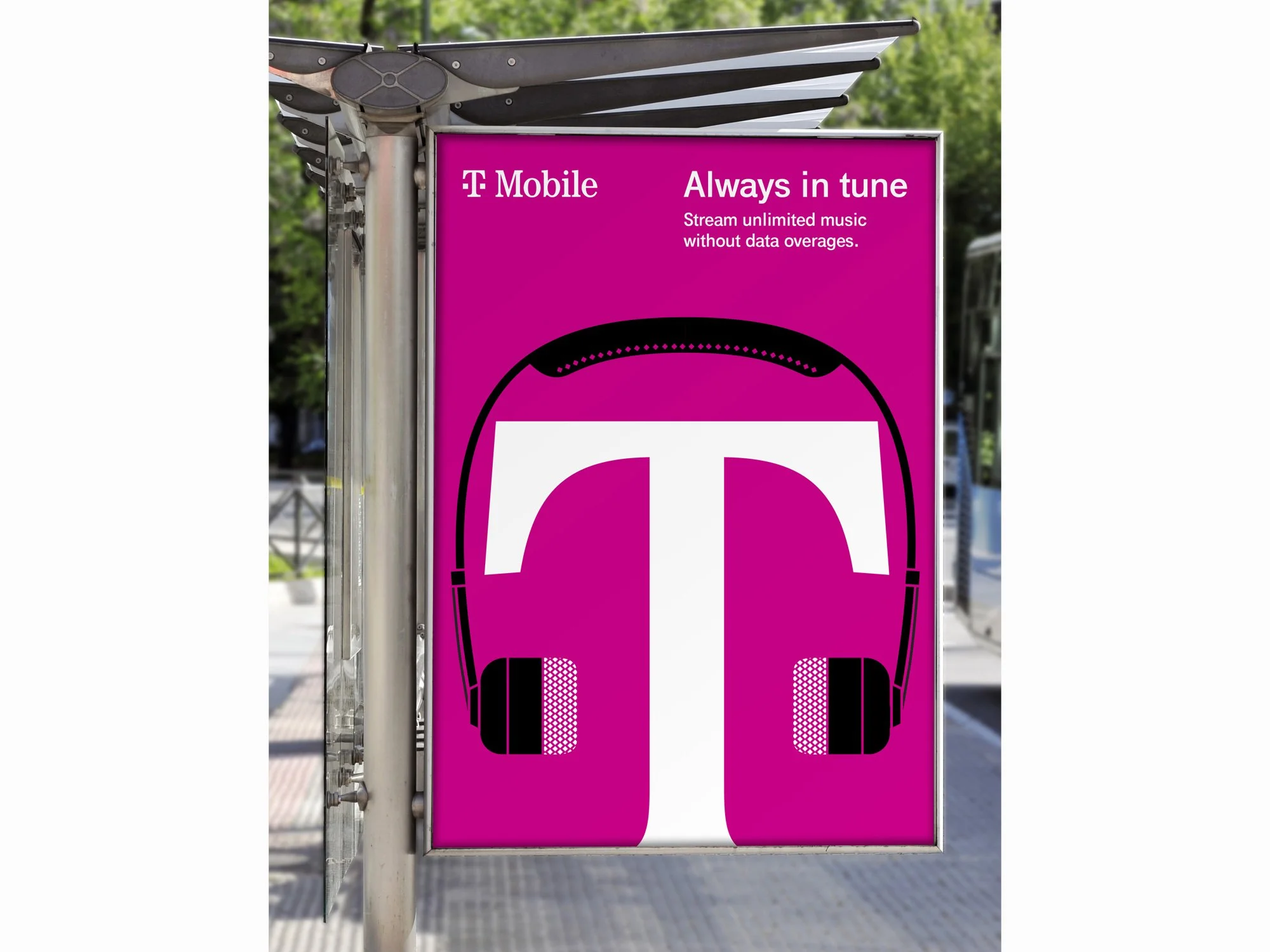

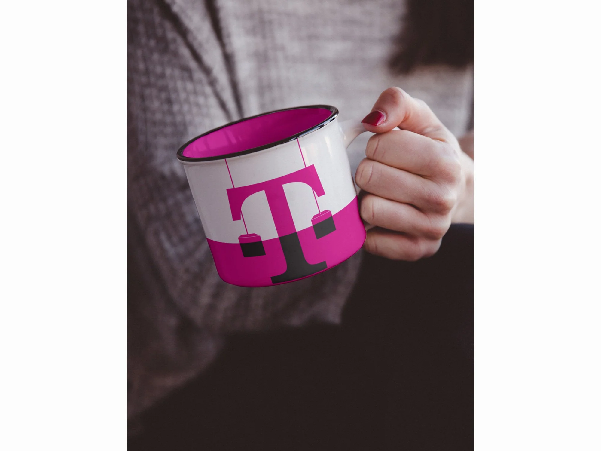
ICONOGRAPHY
We carry the digits and the curves from the T icon into the iconography for an even more ownable and connected system.
credits
Role: Design Director
Agency: Turner Duckworth
Creative Director: Chris Garvey
Designers: Georgiana Ng, Nicole Jordan, Livvy Pierce
Account & PM: Janice McManemy